🛥️ Sea-Level Storytelling: Visual Systems for a Modern Marine Lifestyle

Luxury marine branding deserves more than just crisp navy and a compass rose. It deserves a visual system that breathes. One that invites you in like open water—and carries through every detail with consistency and grace.
This project explores the potential of editorial-inspired creative systems for the marine world. From campaign visuals and catalogs to branded touchpoints and guest-facing experiences, I wanted to build something that felt tactile, elevated, and a little bit unexpected.
Setting the Course
This concept started with a question:
What would happen if yachting design took its cues from hospitality?
What if it was as much about scent, tone, and tactile memory as it was about performance or polish?
That question led to a creative system anchored by consistency, clarity, and story—pulling together AI-powered art direction, editorial layout design, and real-world collateral to imagine a brand that moves like water but lands with intent.

Key Visual Systems & Concept Directions
🧭 Visual Systems at Scale
At RST Brands, I developed packaging and seasonal campaign assets for 1,800+ SKUs—building internal templates, directing studio and lifestyle photography, and coordinating cross-departmental rollouts. That discipline of clarity, alignment, and repeatability shaped how I approached this marine concept.
📚 Editorial Curation Meets Precision Design
My time at Curator Magazine and Material Bank trained me to curate at scale—selecting, licensing, and preparing visual content from over 100 brands. The layouts in this project reflect that eye: clean, intentional, and emotionally fluent.
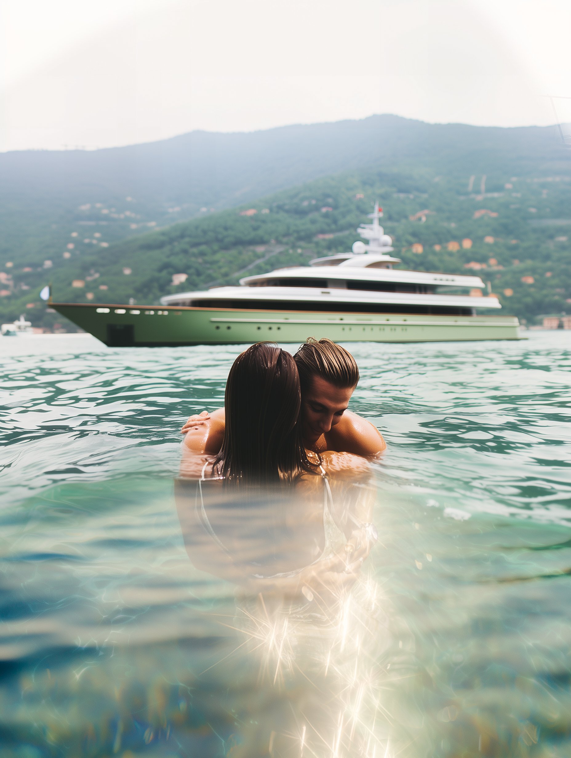
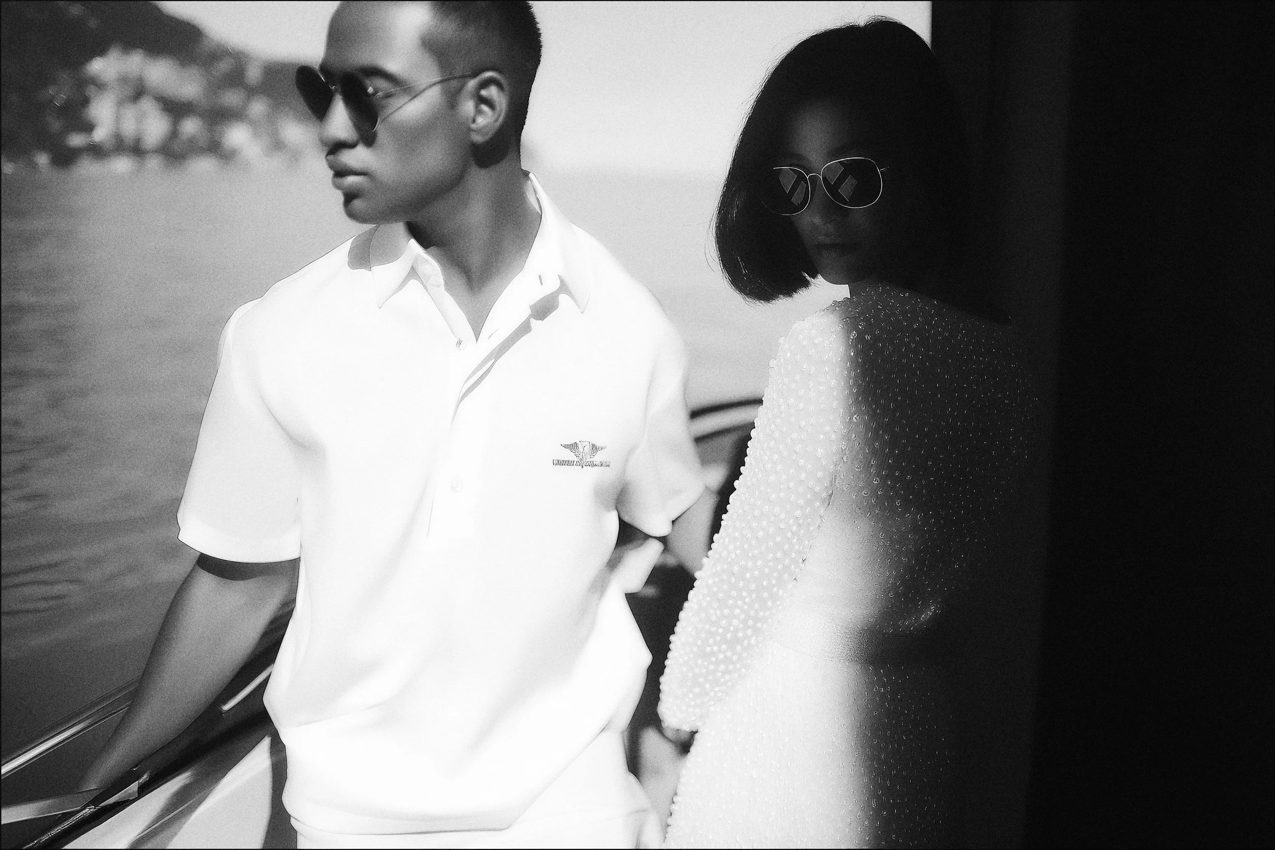
🌊 AI-Enhanced Campaign Concepting
Inspired by yacht design brands like Benetti, I used Midjourney + Adobe to build an editorial-ready campaign concept. These visuals aren’t just speculative—they’re direction-setting. They explore tone, texture, and movement in a way traditional moodboards can’t.
Design That Moves Like Water
Luxury branding is about more than visual polish—it’s about sensation. The way a catalog opens. The tone of voice in an email. The pause between idea and execution.
This project lives in that space. Where systems meet softness. Where branding flows across platforms but never loses its edge. Where everything feels curated, but never overworked.
Let’s make creative that feels like tide and texture—rooted in rhythm, lifted by detail.
—
Ruthie Kohrman
Visual Systems · Campaign Design · Creative Direction